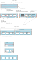
 I've been working on the design a bit more. The top part of the diagram is an anatomical description of what objects in the advanced timeline should look like. Ideally I'd like all objects to support keyframeable properties, not just effects. This will require some changes to PiTiVi core -- in particular, all timeline objects will have to support getting/setting keyframes, which means internally they'll all have gst-controller objects. Personally, I think that's fine: one thing people overwhelmingly seem to want is to be able to directly control image opacity and audio volume.
One thing I'm not quite sure how to handle, though, are simple effects. You see, Edward's paper notes suggest that simple-effects (effects which only take one source as input) should appear in a small gutter above the other timeline objects within a given layer. This gutter would also be used for transitions. But this design leaves no room for over-laying keyframes, unless we allow simple-effects to expand to full height. But if we do that it will be difficult to distinguish beween simple effects and complex effects. So, perhaps *all* effects should simply be full-size objects , as in the above design. One thing I don't like about this, though, is that it's actually kinda hard to tell what's going on. Will videobox apply to just the image source directly below it, or the entire composition?

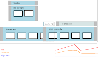
So, I came up with a different design. Move the properties down below the timeline, but keep them in sync with the timeline's scroll position. Now all objects can have as many properties as they want, and they can be kept completely separate from each other (or they could show as overlapping curves, I'm not yet sure which is best. The idea is that you select an object (in this image, the lighter colored simple effect is selected), and the property viewer displays its property graph. If you select multiple objects, one of two things could happen: it could show the intersection of the properties of all selected objects and let you set the same keyframe/values for all selected objects; or the property browser could display the properties of all selected objects individually. Ideally you'd want some combination of both, but I can't think of an elegant way to do that just yet.
Details: In either design, whenever you adjust a property, the viewer should show a preview of the keyframe after the effect has been applied.
2 comments:
Brandon,
What you guys are PiTiVi is great. I'm continue to watch from the sidelines at the progress you guys are making.
One note, transitions, per Edwards description are not simple effects. Transitions always have at least 2 source inputs, and a single output (transition from -> transition to == output). As in the case of the dissolve and your illustrations, the dissolve is meaningless unless it overlaps the previous clip.
of course, this is dependent on the implementation of the effect, as you could apply a "fade-out" effect on the tail end of the leading source, and a "fade-in" on the leading end of the trailing source, and overlap the two to give an appropriate "dissolve", and still fall within Edwards definition, but I think most editors would prefer not to think of it that way.
Basically transitions and simple effects are supposed to appear in the same "gutter". This is because they affect only one layer. I am questioning the logic of this arrangement. It would seem better simply to have layers in which transitions would appear any time two sources overlap, rather than in a separate "gutter". Then you could get rid of the distinction between "simple effects" which have only one input ,and complex effects which have > 1 input. Seems unecessary, really.
Post a Comment