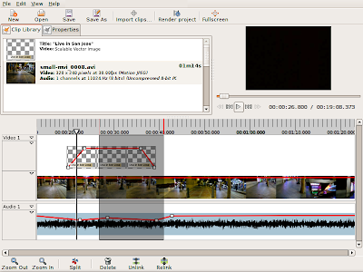
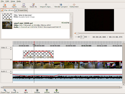
Where we are now
- basic editing works
- text-based configuration file saves useful settings
- limited support for changing priority
- thumbnailing pretty mature (thumbnails are now cached, and there's a maximum limit to how many will be processed at one time)
- seeking with keyboard added
- better menu layout with more keyboard shortcuts
- finally can have audio only files
- lots of little bug-fixes
- ripple / roll editing
- slip-and-slide editing
- don't let clips overlap each other (since we don't support transitions yet)
- user preferences dialog (for the things we can already configure)
- revamp export settings and render dialogs
- clean up error reporting in the timeline
- viewer will seek to appropriate places while clicking and dragging stuff in the timeline
- project file support: has been integrated into the UI but back-end issues have kept us from merging
- property interface for timeline objects
- revive the property editor
- finally implement titles
- ability to rotate and
- keyframing (depends on property interface)
- effects (depend on keyframing)
- mixing and volume on video and audio tracks (a naive implementation wouldn't be hard, but as I understand it there would be performance problems for video, and dealing with those might take longer)
- supporting the X clipboard (for copy/paste)
- undo / redo support
- secondary viewer, so we can do things like show two edit points simultaneously (not really sure how we'll support some of this in the back-end, since it essentially will essentially require having duplicate copy of the timeline)
In the noun-verb UI, you first select what you want, then you issue a command to do something with it. Your data is represented as objects on a canvas, and selection specifies what you want to do. Commands are operations that manipulate or act on the selection. My ideal UI is one that has no tools at all. Everything you want to do you can do simply by defining a selection and issuing a command.
In a few, frequently-used cases, you can specify the noun and the verb at the same time. For example, performing click-and-drag a clip in the timeline, but really this is just a shortcut for "select this. now move it here".
PiTiVi's notion of selection needs to improve. Right now, we have only the most rudimentary notion of selection. Basically, you can only select entire TimelineObjects. Some commands, such as "ungroup", require only a single track-object as a parameter. Other commands, such as "move", need a position as a second parameter. Still others, such as "trim", might want a position and a duration.
To address this, I propose adding two new selection primitives: Regions and Markers. A region represents a slice of the timeline. It's just position and duration, with no content. A marker is just a special case of a region, with no duration. Here's a concept drawing of what timeline regions and markers might look like:

What I haven't settled on just yet is how you'll interact with them. I can't decide if they should be timeline objects in their own right, that you can directly manipulate (in which case there might be many regions you can select, drag around, resize, delete, etc), or if they should work more like the selection marquee in gimp (i.e. there's only one active region or marker at any time, which may or may not be contiguous).
However I decide to do it, there will be two main ways of creating regions (and markers)
- directly, i.e. by clicking and dragging on the canvas
- with the playhead
 In the latter case, there will be a key, such as M, designated for the creation of regions. Pressing and holding M will create a new region with one end-point at the current playhead.
When the playhead moves -- either while seeking or during playback -- the area between the start of the region and the the playhead will hilight.
When you release the M key, the region will be completely defined. A threshold value will be used to determine whether or not a region or a mark should be created.
With this extra notion of regions and markers, it should now be possible to express most operations as imperative commands. For example, to split a clip:
- you would select first the clip(s) and define marker(s)
- invoke the split command either from a menu, toolbar, or keyboard accelerator. The split command would then split the selected clips where they intersect with a region or marker.
- first select the desired clip(s) and define region(s)
- invoke the trim command. The trim command will remove the portion(s) of the selected clip(s) that intersect (positive) or don't intersect (negative) the region(s)
I have already thought of one alternative. Instead of regions, make many more commands quasi-modes instead. Simple commands will still work with a single tap (or menu activation), but more complicated commands which can take a timestamp and/or duration as input would work like the M key described above: pressing the associated accelerator specifies one end-point, and releasing it specifies the other. If the playhead moves, the area in between the two end-points hilights. When the key is released, the command terminates with the final position of the playhead.
For example, trimming (start points) could work as follows:
- move playhead to desired initial position
- press and hold '['
- start position of selected clips will snap as near to the playhead as possible
- while seeking the playhead, the start positions will update
- when the '[' key is released, the command is terminated at the final playhead position.
This approach might become unwieldy on the keyboard. The keyboard accelerators would have to be very carefully placed so as to make one-handed operation possible, and therefore become dependent on the current keyboard layout, requiring that we also have some way to configure the short-cuts. In addition, the shear number of keys that could become involved might make some actions (such as doing a ripple-edit while seeking with the keyboard) impossible to perform. And you might have problems with conflicting modifier keys (shift and ctrl are already used for keyboard seeking, so you can't use them for any command of this type without re-defining the keys used for keyboard seeking).
Implementation
Common to both approaches are the following: almost all user interaction is defined by the current selection, and the desired command. The roadmap for implementation involves the following
Selection
Selection is a class looking something like the following:
- -contents (set of objects)
- -history (stack of previous selections, uniquely identifiable)
- -current playhead position
- *"changed" signal
- +setToObj()
- +addObj()
- +removeObj()
- +setTo()
- +clearSelection()
- +getSelectedObjects([type,...])
- we can now put in the boilerplate code to get the selection from the currently-focused widget.
- For the TimelineCanvas widget in particular, we'll extract the current selection data from our private Selection object
- now we can support the X clipboard
- the selection object should be able to contain any core object we care to select
- we need to be able to iterate over all the items in the selection, optionally filtering out the types of objects we don't want. For example, I could get a list of just the track objects included in the current selection. Or I could get a list of all the timeline objects which intersect the current selection (i.e. at least one of their track-objects is selected), or I could get a list of just the keyframe objects included in the selection.
- ...after I work out which approach to use
Commands are classes looking something like the following:
- -name
- -label
- -description
- -default accelerator
- -selection
- -stock_id
- +do(selection_id)
- +undo(selection_id)
- +set_available(selection)
- commands can be installed modularly
- we need some global registry of all installed commands
- automatically create menu items and toolbar shortcuts for all commands
- refactor most user actions into Commands
- when the selection changes, all of the installed commands peek at the selection and decide if they should be sensitive or not.
- some minimum interface needs to be supported by all selectable objects, because some commands (such as delete) should be universal
- but other commands will access specific instance methods, and they shouldn't be active if the current selection doesn't contain the right objects
- we can easily do unit testing on the UI now, because now have a programatic way to invoke most actions
- somewhere in the UI, maintain the undo and redo stacks.
- All completed commands get pushed onto the undo stack when their do() method finishes successfully
- undo pops the undo stack and calls undo() on the command
- the command is pushed onto the redo() if it finishes successfully
- for click-and-drag commands, we need to push equivalent commands onto the undo stack
- need to record the state of the selection at each command invocation
- On which side of the core-ui split do commands, selections, and regions fall? what about the undo stack?
- if selection seems to be both a core and a ui notion, does it make sense to have two Selection classes, a core Selection which just handles back-end objects, and a UI selection which wraps the core selection and also handles UI-specific details, like the X clip board
- should commands be entirely static classes or do we need to instantiate them?
- do we really need to maintain a separate selection history, or can we just push the current selection on the undo stack along with the appropriate command? maybe we make selection management internal to command objects (i.e. we set save and restore the selection as appropriate during calls to do() and undo())
- would it be good or bad idea to consider the playhead the default marker?
- would it be a good or bad idea to consider the entire timeline the default region? maybe this should be command-specific.
1 comment:
Just a small note, I like how Glade 3 in trunk has it's undo button with a drop-down arrow that describes the name of the actions you can undo in words.
Post a Comment