Saturday, September 13, 2008
Anonymous Comments are moderated
They will not show up right away. Only one submission is necessary.

Thursday, September 11, 2008
An argument for removing the simple timeline
The problem with the simple and advanced time-line is that the two UIs present different and incompatible abstractions to the user. I'll give you an example. The simple timeline allows for setting clip volume through a slider. Presumably, we want to set a constant volume. The advanced timeline will ultimately allow you to set the clip volume to an arbitrary interpolation curve. These are two different, incompatible representations for volume.
Imagine that a user has spent countless hours tweaking the volume key-frames for a clip. What, then, happens if they switch to the simple time-line. What value does the volume slider display? What happens when the user moves the clip's volume slider? Does it flatten the curve? In that case, should we bring up an obtrusive dialog to warn them against what they are doing?
The easiest solution I can think of is to drop the volume slider from the simple time-line (making the simple time-line much less useful). A better, but harder solution is to keep track of whether key-framing has been enabled on a clip, and if so, disable the volume slider in the simple time-line. This creates extra work. A third solution is to prevent the user from returning to the simple time-line once they've activated certain features, like key-framing. This could be frustrating, though, if the user was exploring and the changes were accidental.
An altogether bizarre solution would be to adjust all the slider values based on the current playback position (through property notifications). The sliders would move up and down during seeking and playback as if moved by ghosts (following the interpolation curve). Moving a slider would essentially create and set a key-frame at the current playback position. This would seem to be an ideal solution at first, because it makes the simple timeline equally as powerful as the advanced time-line. Imagine, though, how frustrating this would be for the user: they set the volume in one part of the clip, seek to another, and the volume has changed. It's not obvious why. So, they move the slider back. The user thinks their changes just didn't take, when actually they're editing a completely hidden data-structure. When they go to preview the video, the audio volume goes up and down erratically.
This is exactly the kind of unnecessary problem caused by splitting the UI. You have one application model and two views. Basically it's pretty much impossible to decouple the view from the model entirely -- the two are going to remain highly coupled because the view is a representation of the model. If you try to support two incompatible views with the same model, your model becomes schizophrenic.
According to the late Jeff Raskin (one of the original designers of the Macintosh), the concept of having a basic and an advanced mode is fundamentally flawed:
Imagine that a user has spent countless hours tweaking the volume key-frames for a clip. What, then, happens if they switch to the simple time-line. What value does the volume slider display? What happens when the user moves the clip's volume slider? Does it flatten the curve? In that case, should we bring up an obtrusive dialog to warn them against what they are doing?
The easiest solution I can think of is to drop the volume slider from the simple time-line (making the simple time-line much less useful). A better, but harder solution is to keep track of whether key-framing has been enabled on a clip, and if so, disable the volume slider in the simple time-line. This creates extra work. A third solution is to prevent the user from returning to the simple time-line once they've activated certain features, like key-framing. This could be frustrating, though, if the user was exploring and the changes were accidental.
An altogether bizarre solution would be to adjust all the slider values based on the current playback position (through property notifications). The sliders would move up and down during seeking and playback as if moved by ghosts (following the interpolation curve). Moving a slider would essentially create and set a key-frame at the current playback position. This would seem to be an ideal solution at first, because it makes the simple timeline equally as powerful as the advanced time-line. Imagine, though, how frustrating this would be for the user: they set the volume in one part of the clip, seek to another, and the volume has changed. It's not obvious why. So, they move the slider back. The user thinks their changes just didn't take, when actually they're editing a completely hidden data-structure. When they go to preview the video, the audio volume goes up and down erratically.
This is exactly the kind of unnecessary problem caused by splitting the UI. You have one application model and two views. Basically it's pretty much impossible to decouple the view from the model entirely -- the two are going to remain highly coupled because the view is a representation of the model. If you try to support two incompatible views with the same model, your model becomes schizophrenic.
According to the late Jeff Raskin (one of the original designers of the Macintosh), the concept of having a basic and an advanced mode is fundamentally flawed:
Psychologist Clifford Nass....reflects on the common assumption that users can be grouped into two classes: beginners and experts, perhaps with a few temporarily in transition. This dichotomy is invalid. As a user of a complex system, you are neither a beginner nor an expert, and you cannot be placed on a single continuum between these two poles. You independently know or do not know each feature or each related set of features that work similarly to one another. You may know how to use many commands and features of a software package; you may even work with the package professionally, and people may seek your advice on using it. Yet you may not know how to use or even know about the existence of certain other commands or even whole categories of commands in that same package. For example, a user of a photo-processing application who produces only online images may never need, or even learn of, that same application's facility for doing color separations, a feature needed primarily by commercial printers.In other words, if we've done our job right, new users should have no trouble learning the interface (provided they have sufficeint knowledge of video editing). We need to strive to make things clear, simple, and visible. I don't know how much clearer you can get than a proportional timeline in which the length of a clip is proportional to its duration. I don't know how much simpler you can get than click-and-drag to move or resize the clip. We make things more visible by putting all the features of the program out in the open, particularly key-frames, where users can see them. And this system works for advanced users too: by focusing on noun-verb interaction and drag-and-drop, we eliminate modes, and provide monotony, allowing users to get comfortable with the command set.
Interface designers have tried various approaches to accomodate the premise that usres can be separated into beginners and experts. Because this premise is false, the approaches have failed. Adaptive systems that shift automatically from beginner mode to expert mode when they judge your compentance has reached a certain level is are a good example....On the other hand, there is no theory that tells us that the same fixed interface cannot work well over the full span of a person's experience with it, from novice to old timer. It seems best not to have to shift paradgims during your use of the product, and no elaborate analysis is needed to reveal the advantage of having to learn only one interface to a task.
It is easy to fall into the trap of designing different interfaces for different classes of users because by doing so you can make sweeping assumptions that simplify the design process. Few such assumptions are likely to be true of every user in any reasonably large class of users that you specify. The antidote is to view an interface not from the perspective of a class of users but rather through the eyes of an individual. Every person who uses software over a long period goes through a relatively brief period of learning for each feature or command and a far longer period of routine (and, we hope, automatic) use. We do need to design systems that are easy to learn and understand, but it is more imporant that we make sure that these systems can be efficiently used in the long run.
The learning phase of working with a feature involves your conscious attention. Therefore, simplicity, clarity of function, and visibility are of great importance. The expert phase is predominantly characterized by unconscious use of the feature; such use is enhanced by such qualities as aptness to the task, modelessness, and monotony. These requirements are not in conflict; therefore, a well-designed and humane interface does not have to be split into beginner and expert subsystems. (The Humane Interface, p 68-70)
Wednesday, September 10, 2008
Future Plans
This is my personal wish-list of PiTiVi development. This represents my goals for the next 4 months or so of development, assuming a lazy pace:
The problem with the simple and advanced time-line is that the two UIs present different and incompatible abstractions to the user. For example, imagine that a user has spent countless hours tweaking the volume key-frames for a clip. What, then, happens if they switch to the simple time-line and move the clip's volume slider? Does it flatten the curve? What value does the volume slider display? The easiest solution to this problem is to drop the volume slider from the simple time-line (or at least disable it if key framing is enabled.
- Deprecate the Simple Timeline, or at least scale back it's scope so that changes to the simple timeline cannot do much damage in the advanced timeline.
- Add seeking previews during drag operations
- Rudimentary undo support
- Editing markers
- Still Images
- Still Image Sequences
- Design Undo/Redo framework
The problem with the simple and advanced time-line is that the two UIs present different and incompatible abstractions to the user. For example, imagine that a user has spent countless hours tweaking the volume key-frames for a clip. What, then, happens if they switch to the simple time-line and move the clip's volume slider? Does it flatten the curve? What value does the volume slider display? The easiest solution to this problem is to drop the volume slider from the simple time-line (or at least disable it if key framing is enabled.
Monday, September 8, 2008
Guadec Wrap-Up
Guadec is officially over now. I have taken the final step of uploading a tar ball to Google's website (this is a formality). The work from SoC has been merged into trunk, but unfortunately problems have materialized in testing. School has started for me which means I am scaling back my commitment of time. I'm hoping to hear from new developers who want to pick up where I left off. A couple of things need to be more fully specified:
I need to update my design document a bit: I actually want to make the UI a little more general. Instead of a "content-image" portion of each timeline object, I just want to have a "UI" portion. I want to be able to define custom UI for different kinds of media and effects that will appear within each box. The default "UI" will be a keyframe editor, but other UI modules could be constructed. The trick will be in choosing which UI will appear when. Perhaps a factory-based system could be used, mapping factory types to their appropriate UI. This would be good for plugins that want to define new source/effect types and then have UI for them.
The simple timeline broke somewhere between the time I stopped working on it and the end of the summer. I have no idea what's going on, but it's damned annoying. I'm kindof not that interested in maintaining the simple timeline anymore. I'd much rather focus on the advanced timeline, because really, advanced isn't that hard to deal with. The goal of the simple timeline was to be easy to implement, IMHO, and it's actually a little harder to work on than the advanced timeline at this point. But in any case, being able to switch back and forth is going to create complications that I don't really want to have to worry about.
Edward is working on switching PiTiVi and gstreamer over to git (from svn). When that happens I'll start maintaining my own branch where I can hack on some things a little more freely. In the mean time, my future commits will probably be related to bug fixes so that people can actually use the work that I did this summer.
Finally, There's one new feature I wanted to add to make the minimal feature set that the advanced timeline now support a little bit nicer: When you trim a source or drag a source in the timeline, I want the viewer to seek to the relevant edit point. I.e. when you move a source, you should see the point in the timeline just before where that source comes in in the viewer. When you trim a source, you should see the exact in-point that you have set in the viewer. All of this should happen while you are dragging the mouse so that you get instant feedback on your editing decisions.
- Undo/Redo support (which operations will support it), and how to implement it
- Back end support for effects and transition
I need to update my design document a bit: I actually want to make the UI a little more general. Instead of a "content-image" portion of each timeline object, I just want to have a "UI" portion. I want to be able to define custom UI for different kinds of media and effects that will appear within each box. The default "UI" will be a keyframe editor, but other UI modules could be constructed. The trick will be in choosing which UI will appear when. Perhaps a factory-based system could be used, mapping factory types to their appropriate UI. This would be good for plugins that want to define new source/effect types and then have UI for them.
The simple timeline broke somewhere between the time I stopped working on it and the end of the summer. I have no idea what's going on, but it's damned annoying. I'm kindof not that interested in maintaining the simple timeline anymore. I'd much rather focus on the advanced timeline, because really, advanced isn't that hard to deal with. The goal of the simple timeline was to be easy to implement, IMHO, and it's actually a little harder to work on than the advanced timeline at this point. But in any case, being able to switch back and forth is going to create complications that I don't really want to have to worry about.
Edward is working on switching PiTiVi and gstreamer over to git (from svn). When that happens I'll start maintaining my own branch where I can hack on some things a little more freely. In the mean time, my future commits will probably be related to bug fixes so that people can actually use the work that I did this summer.
Finally, There's one new feature I wanted to add to make the minimal feature set that the advanced timeline now support a little bit nicer: When you trim a source or drag a source in the timeline, I want the viewer to seek to the relevant edit point. I.e. when you move a source, you should see the point in the timeline just before where that source comes in in the viewer. When you trim a source, you should see the exact in-point that you have set in the viewer. All of this should happen while you are dragging the mouse so that you get instant feedback on your editing decisions.
Wednesday, August 13, 2008
Choices
 I've been working on the design a bit more. The top part of the diagram is an anatomical description of what objects in the advanced timeline should look like. Ideally I'd like all objects to support keyframeable properties, not just effects. This will require some changes to PiTiVi core -- in particular, all timeline objects will have to support getting/setting keyframes, which means internally they'll all have gst-controller objects. Personally, I think that's fine: one thing people overwhelmingly seem to want is to be able to directly control image opacity and audio volume.
One thing I'm not quite sure how to handle, though, are simple effects. You see, Edward's paper notes suggest that simple-effects (effects which only take one source as input) should appear in a small gutter above the other timeline objects within a given layer. This gutter would also be used for transitions. But this design leaves no room for over-laying keyframes, unless we allow simple-effects to expand to full height. But if we do that it will be difficult to distinguish beween simple effects and complex effects. So, perhaps *all* effects should simply be full-size objects , as in the above design. One thing I don't like about this, though, is that it's actually kinda hard to tell what's going on. Will videobox apply to just the image source directly below it, or the entire composition?

So, I came up with a different design. Move the properties down below the timeline, but keep them in sync with the timeline's scroll position. Now all objects can have as many properties as they want, and they can be kept completely separate from each other (or they could show as overlapping curves, I'm not yet sure which is best. The idea is that you select an object (in this image, the lighter colored simple effect is selected), and the property viewer displays its property graph. If you select multiple objects, one of two things could happen: it could show the intersection of the properties of all selected objects and let you set the same keyframe/values for all selected objects; or the property browser could display the properties of all selected objects individually. Ideally you'd want some combination of both, but I can't think of an elegant way to do that just yet.
Details: In either design, whenever you adjust a property, the viewer should show a preview of the keyframe after the effect has been applied.
Monday, August 11, 2008

Still thinking about the current problem of multiple selection draging. The only thing I've been able to work out so far is that there needs to be some separation between the event handling code and the widgets presented to the user. In other words, rather than doing Model/View-controller, there really should be separate Model/View/Controller objects. Goocanvas items are View-Controller objects: they represent data in the view, but they also handle user interaction. This is convenient when there's a one-to-one relationship. I wrote most of my code with this assumption in mind, so it's really easy to make any canvas item independently movable. Trying to move several items together poses a problem because each item will have an explicit pointer grab and receive all the pointer events. This is best summarized with the following diagram:

The alternative is to have some other object handle all the pointer events, and set the appropriate properties on the core objects:
 I like this idea because it allows the selection to simply be the set of core objects on which the next command will take effect. It allows goocanvas and GTK to do all the event handling, however, it puts all of the logic for user interaction in one place: the signal handler attached to the root canvas item. Why is that bad? because not all PiTiVi core objects are alike, and not all have the quite the same interface. In particular, some objects have media-start/media-duration, while others don't. And if the media/start-media duration are not kept in sync with timeline start/duration, wierd things will happen. It would be great if they did, and this might be motivation to develop a consistent interface for all the PiTiVi core objects (i.e. abstract media-duration into media-offset).
Another way to get around this is to subclass the base UI timeline object and provide a handler which does the actual property setting. I don't really like this because it means that the current selection is a list of UI objects. This means the UI has to filter out the canvas items which are not directly selectable (because many items are actually groups of items).

Still another way of doing this might be to move the notion of selection out of the UI and into the back end.
In any case, the trimming handles on each source are a special case: we don't want to resize all the objects in the selection at the same time (do we?) My intuition tells me that users wouldn't care for that very much, because I wouldn't care for that very much. This isn't the end of the world: one simple solution would be to implement trimming handles as separate objects (as is currently done), and let them handle their own events. This way they won't propagate up to the root item, and therefore won't affect the current selection. And we can do this for any kind of UI element we don't want to become individually selectable, like, for example, objects representing keyframes on an effect item.
Wednesday, August 6, 2008
Redesign
Things were plodding along fairly well until I tried to start working on multiple-selection-dragging . I got stuck, seriously stuck. I couldn't find a clean way to handle this. Things got even worse when I started thinking about how I would implement keyframes and editing markers. I decided to go back to the drawing board:
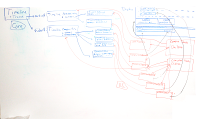 Basically, after taking a few days a few days to deal with personal matters, I started redesigning the implementation of the advanced UI from scratch. I haven't written a single line of code.
The inspiration that I hit upon recently is the idea of a Control Point, which is a generalized mapping between something the user can see and manipulate to an arbitrary property belonging to some object in the model. The idea is that for every property in PiTiVi core that you want to control, you have a control point to control it. In addition, when properties in the advanced UI change, the control points update their values as well. This way, objects in the UI are actually defined either as control points or as sets of control points. All the user interaction will be routed through a central Selection object, and then dispatched to all the selected control points. This supports everything from multi-selection dragging to handling undo/redo.
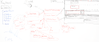
Where this idea goes wrong is when you have an object defined as a relationship between control points that is not one-to-one. For example, the relationship between the start/duration properties of a TimelineObject and the Start/End points of a ComplexTimelineObject is not one-to-one. If you adjust the start or end point of the object independently, both the start and the duration values change. If you adjust the Start/End points together, only the Start property changes. This is a consequence of the mathematical relationship between the out-point of the object and the source's start/duration. I'm not quite sure where to go from here, but I think the best course of action is to provide a layer of indirection between the control points and properties. If you have a proxy object which has an in-point and an out-point, which in turn computes start/duration, for example, all the UI Selection object needs to care about are the In/Out control points.
 Basically, after taking a few days a few days to deal with personal matters, I started redesigning the implementation of the advanced UI from scratch. I haven't written a single line of code.
The inspiration that I hit upon recently is the idea of a Control Point, which is a generalized mapping between something the user can see and manipulate to an arbitrary property belonging to some object in the model. The idea is that for every property in PiTiVi core that you want to control, you have a control point to control it. In addition, when properties in the advanced UI change, the control points update their values as well. This way, objects in the UI are actually defined either as control points or as sets of control points. All the user interaction will be routed through a central Selection object, and then dispatched to all the selected control points. This supports everything from multi-selection dragging to handling undo/redo.

Where this idea goes wrong is when you have an object defined as a relationship between control points that is not one-to-one. For example, the relationship between the start/duration properties of a TimelineObject and the Start/End points of a ComplexTimelineObject is not one-to-one. If you adjust the start or end point of the object independently, both the start and the duration values change. If you adjust the Start/End points together, only the Start property changes. This is a consequence of the mathematical relationship between the out-point of the object and the source's start/duration. I'm not quite sure where to go from here, but I think the best course of action is to provide a layer of indirection between the control points and properties. If you have a proxy object which has an in-point and an out-point, which in turn computes start/duration, for example, all the UI Selection object needs to care about are the In/Out control points.
Subscribe to:
Posts (Atom)