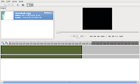
The goocanvas version of the advance timeline is taking shape. The above screen shot shows a timelinew with a single source zoomed in. I haven't tried messing with multiple sources, but it shoul work alright. This revision is a bit of a regression, as the timeline now lacks the ability to trim sources, but you can move them. The timeline is also miss-aligned. My gut tells me that it's in the wrong spot to begin with, and the best thing to do would be to drop it down below the toolbar. This would leave more room for other tools, like a trimming tool.
Now is where I need your help: color schemes, layout suggestions, usability concerns. The current source widgets are just rectangles, do people want thumbnails or just text to cover those? How should effects be represente visually? I don't really want to go too much farther without a good idea of what people want to see.
No comments:
Post a Comment