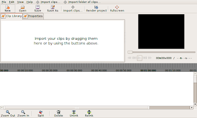
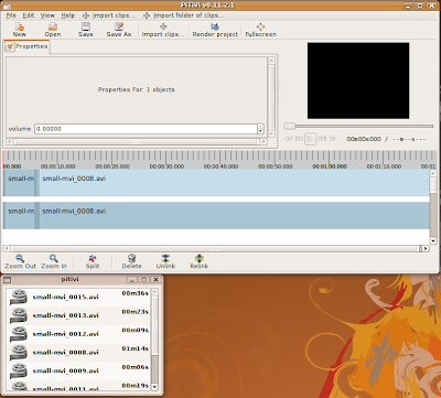
 I decided that the default layout of PiTiVi's controls was pretty stupid, so I spent some time tweaking that today. First, I adjusted the way in which space is divided among the three main interface components. By default, you'll see this arrangement. When you resize or fullscreen PiTiVi's main window, only the timeline area grows, unless you explicitly move the separator. I think most users will appreciate this.
 Today also marks the introduction of two new features: Detachable components, and the property editor.
Detachable Components
This feature you to separate each of the tabs above the timeline into a separate window by clicking the button next to the tab label. When you close the new window, the tab returns to its original position. Eventually the viewer will be detachable as well, but my first attempt at implementing this caused PiTiVi to crash immediately! Since we're planning to clean up the viewer code soon, I decided it made sense to hold off on making it detachable. Why did I spend time on this? Because some people will have multiple screens on which they'd like to work, and we want people to be able to full-screen the viewer if they choose. There's currently no way to full-screen a window across multiple screens. I also suspect that the default layout is going to feel cramped for some people, and I decided that the most flexible approach is simply to let people move whatever component they want into its own window.
Some of you may have noticed that I did things a little differently than other GTK+ applications. The truth is that I don't really like the drag-and-drop tab approach taken by the gimp. For one thing, it's not clear that the feature exits in the first place, since there's nothing to clue you into the fact that the tabs are movable (hell, I didn't even know you could do that...). This system has the advantage of simplicity. Either a component is in the main window or its own window. To detach it, you click the button next to its name. To restore it to its original location, just close the window you opened. PyGTK makes it really easy to pull this kind of trickery.
Property Editor
The Property Editor is going to become a central component of PiTiVi's interface. This is where you'll have access to the 'special' features of the objects you select in the timeline. As an example, consider the use case of still images. You may import a large image and wish to crop it down to a section. The image may be a portrait and you might want to rotate it 90 degrees. At the moment, we have code to support images, but up until now there was no place in the UI for you to adjust these kinds of settings. Basically whenever an object needs a specialized interface, it will appear in the Property Editor when you select the object.
10 comments:
Detachable is nice. I don't understand how closing a window is going to restore it in its original state though. Shouldn't that be an extra window button? I seem to remember quite an elegant solution in gedit involving a tiny square to detach/re-attach
Also, maybe this link is another idea: http://ru.youtube.com/watch?v=sG-98c70GL4&feature=related
Have you considered using the gdl library for detachable windows? It is the one Anjuta uses and is fairly easy to work with. I understand why you may wish to create your own feel, which is cool, however gdl is there, has python bindings and would save you the trouble of implementing some of the more advanced features such as docking elements in different places.
If by GDL you mean the GNOME Development Library, then definitely I don't want to add that dependency for the sake of an extraneous feature. I also don't feel that you want to enable things like docking components in different places. I think from a UI standpoint it's actually rather a bad thing. One thing I might consider doing, though, is hiding the detach buttons on all but the current tab, to reduce the tendency for accidental clicking. I understand that maybe there should be a friendlier-looking "restore" button, but at the same time I don't think clicking the window's destroy button should do anything destructive, like close a window with no way to get it back.
where is the latest source, so we can play with this?
in your screenshot I see 11.2.1
but on http://ftp.gnome.org/pub/GNOME/sources/pitivi/0.11/
I do not see that version.
Some comments on the UI:
- Why do you have multiple timelines? I mean the one that looks like a slider under the video preview, and the big one at the bottom.
- The way the controls are laid out now, seems to indicate that the play button, fast forward button, etc control the video preview, but not the big timeline at the bottom. Is this intentional?
- What about splitting it up in smaller, separate programs that work well together: a Video Library (could even be a Nautilus plugin), and a Video Timeline.
The code is available in my git-hub repository, git://github.com/emdash/pitivi.git . Detailed instructions can be found here: http://pitivi.org/wiki/Git_Instructions
" Anonymous said...
Some comments on the UI:
- Why do you have multiple timelines? I mean the one that looks like a slider under the video preview, and the big one at the bottom."
This is because, in fact, one represents the video track and the other represents the audio track.
" - The way the controls are laid out now, seems to indicate that the play button, fast forward button, etc control the video preview, but not the big timeline at the bottom. Is this intentional?"
The viewer needs work, I agree. The viewer controls tell the viewer to play whatever it is set to play, which is the timeline if you're working in the timeline, or a clip if you're previewing a clip. It might make more sense to have playback controls for the timeline in the timeline toolbar.
" - What about splitting it up in smaller, separate programs that work well together: a Video Library (could even be a Nautilus plugin), and a Video Timeline."
Uhh, no. The video library in PiTiVi represents the list of clips added to the current project, not the list of videos available on a particular machine. Despite the fact that you can now place it a separate window, it's still very tightly coupled to PiTiVi's inner workings. In any case, we're trying to avoid unnecessarily tying pitivi to any particular desktop environment, such as GNOME. PiTiVi is already 'integrated' insofar as you can drag-and-drop video files from nautilus or thunar into the library, and they will be automatically added.
November 3, 2008 10:59 AM
"I understand that maybe there should be a friendlier-looking "restore" button, but at the same time I don't think clicking the window's destroy button should do anything destructive, like close a window with no way to get it back."
Your point being why add an extra window button when there is already a closing button and really you don't want to get rid of it completely at any time other than quiting pitive. Ideally you could replace the cross with a re-attach icon, but I don't know how well that would work in all gnome-themes.
"It might make more sense to have playback controls for the timeline in the timeline toolbar."
Not really I think: the slider isn't strictly necessary in the viewer, but IMHO the playback controls are expected there.
Besides, you will want to open a temporary window for viewing a (source) clip without replacing the timeline of your edit (sequence/target). That window will have playback controls. In my opinion, source and target playback windows should be as similar as possible.
a git-clone of your master branch crashes at startup
Seems unable to find sourcelist.SourceList. I add it to pythonpath, and it fails, unable to add it to the project tab.
Have you forgotten a ui/sourcelist.py ?
I did, in fact, forget to check in sourcelist.py. Sorry about that. It should be fixed now.
Post a Comment