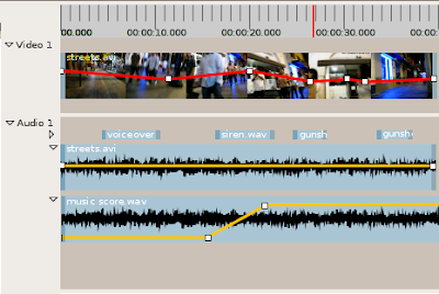
 Recently I've realized that there are a number of things about PiTiVi that were and still are not clear in my mind. So, I've been working on improving the PiTiVi UI design document, particularly with mock-ups -- these are still images or sequences of still images which show how the program is supposed to behave. I've been working for quite a while, but the longer I work, the more unfinished things I seem to notice. On the other hand, it's a pretty amazing experience to watch previously vague ideas start to "gell" into something coherent. I actually have a much better idea how pitivi's features fit together, and where I still need to put more thought into the design.
You can see some of the work i've uploaded here: http://pitivi.org/wiki/UI_Design. At first it was slow-going. It had been several versions since I'd used GIMP. Also, it was a bit tedious to build up components like long strips of 50-pixel high thumbnails. Now that I have a library of bits and pieces, it's a little easier to build the scenarios I dream up. Anyways, I think I've identified most of the areas that I need to develop image sequences for.
As always, I welcome your feedback. Also, if anyone wants to help with this, talk to me.
6 comments:
Very nice mockup. Keep it going.
i wander what is the best between :
- 2 icons (Unlink and Relink) on the toolbar at the bottom of the screen
- or a lock (1) or chain (2) with 2 status (open/close) on the left vertical panel, in front of video/audio tracks ?
(1) http://www.rrze.uni-erlangen.de/wir-ueber-uns/organigramm/tango-rrze/scalable/emblems/lock.svg
(2) see gimp image/resize window http://www.ellies-treasures.com/gimptuts-getting-started/resize%20window.jpg
Could you explain this a little more clearly? I'm quite sure I understand...
see these mockups (i like the one with the chain, derivated from Gimp) :
http://www.imagup.com/imgs/1227362645.html (1)
http://www.imagup.com/imgs/1227362766.html
this is an alternative GUI to the one found at http://dotsony.blogspot.com/2008/11/icons-found.html where Unlink/Relink are 2 separate icons in a bottom panel
Cinelerra also have a left panel with such functionalities http://ghsm2.com/_Softwares/Cinelerra/Screenshot_Cinelerra/cinelerra_m.jpg
(1) Lock/unlock icons are from http://gramps-project.org/wiki/index.php?title=GRAMPS_icon_set
In my current design, link/unlink are not per-track operations, they are per-object operations. As such, they appear as commands in the command bar on the bottom of the timeline. It's also not meant to be a boolean toggle, you can link together arbitrary objects.
Post a Comment