Sunday, December 28, 2008
Thumbnails \o/
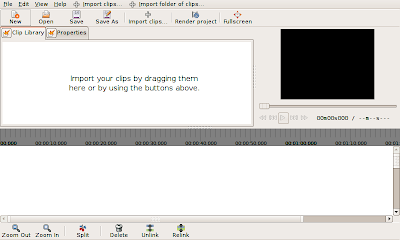
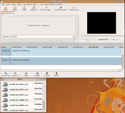
After several weeks of often-interrupted effort, I have finally made progress on support for thumbnails on video clips. Thumbnails are fetched asynchronously and then cached. I have optimized the drawing routines to only draw the visible portions of each clip, so the thumbnail strips render quickly and do not seem to significantly slow down dragging or trimming on my machine. I'm fairly satisfied with the results. What remains now is to implement a caching strategy so that we don't eventually consume all available memory with 50x50 thumbnail images. I'm working on this in parallel with waveforms, which present slightly different challenges. Eventually I hope to modularize both thumbnail and waveform code in such a way that we can easily add new media types to PiTiVi, or optimize special cases such as still images (which just display the same thumbnail repeatedly).
In other news, I have finished my undergaduate education at UC Berkeley. Man, that feels good.
Sunday, November 16, 2008
Mockups
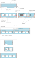
Recently I've realized that there are a number of things about PiTiVi that were and still are not clear in my mind. So, I've been working on improving the PiTiVi UI design document, particularly with mock-ups -- these are still images or sequences of still images which show how the program is supposed to behave. I've been working for quite a while, but the longer I work, the more unfinished things I seem to notice. On the other hand, it's a pretty amazing experience to watch previously vague ideas start to "gell" into something coherent. I actually have a much better idea how pitivi's features fit together, and where I still need to put more thought into the design.
You can see some of the work i've uploaded here: http://pitivi.org/wiki/UI_Design. At first it was slow-going. It had been several versions since I'd used GIMP. Also, it was a bit tedious to build up components like long strips of 50-pixel high thumbnails. Now that I have a library of bits and pieces, it's a little easier to build the scenarios I dream up. Anyways, I think I've identified most of the areas that I need to develop image sequences for.
As always, I welcome your feedback. Also, if anyone wants to help with this, talk to me.
Saturday, November 8, 2008
bling
Sunday, November 2, 2008
The Shape of Thigns To Come
I decided that the default layout of PiTiVi's controls was pretty stupid, so I spent some time tweaking that today. First, I adjusted the way in which space is divided among the three main interface components. By default, you'll see this arrangement. When you resize or fullscreen PiTiVi's main window, only the timeline area grows, unless you explicitly move the separator. I think most users will appreciate this.
Today also marks the introduction of two new features: Detachable components, and the property editor.
Detachable Components
This feature you to separate each of the tabs above the timeline into a separate window by clicking the button next to the tab label. When you close the new window, the tab returns to its original position. Eventually the viewer will be detachable as well, but my first attempt at implementing this caused PiTiVi to crash immediately! Since we're planning to clean up the viewer code soon, I decided it made sense to hold off on making it detachable. Why did I spend time on this? Because some people will have multiple screens on which they'd like to work, and we want people to be able to full-screen the viewer if they choose. There's currently no way to full-screen a window across multiple screens. I also suspect that the default layout is going to feel cramped for some people, and I decided that the most flexible approach is simply to let people move whatever component they want into its own window.
Some of you may have noticed that I did things a little differently than other GTK+ applications. The truth is that I don't really like the drag-and-drop tab approach taken by the gimp. For one thing, it's not clear that the feature exits in the first place, since there's nothing to clue you into the fact that the tabs are movable (hell, I didn't even know you could do that...). This system has the advantage of simplicity. Either a component is in the main window or its own window. To detach it, you click the button next to its name. To restore it to its original location, just close the window you opened. PyGTK makes it really easy to pull this kind of trickery.
Property Editor
The Property Editor is going to become a central component of PiTiVi's interface. This is where you'll have access to the 'special' features of the objects you select in the timeline. As an example, consider the use case of still images. You may import a large image and wish to crop it down to a section. The image may be a portrait and you might want to rotate it 90 degrees. At the moment, we have code to support images, but up until now there was no place in the UI for you to adjust these kinds of settings. Basically whenever an object needs a specialized interface, it will appear in the Property Editor when you select the object.
Saturday, November 1, 2008
Icons Found
Wednesday, October 29, 2008
Icons Needed
My refactoring of the UI is nearly complete, so I've started adding new features to PiTiVi. Today I got the Unlink/Relink features working. Normally audio and video clips are linked together. Now you can unlink them and manipulate them separately. Relink allows you to reconnect a source to it's mate if you Unlinked them by accident. I have a couple more features planned for the near future, including: "collapse", which eliminates gaps in the selection; and select-before and -after, which select all sources right or left of the currently selected source(s).
This means we'll need some artwork to help represent these features. I'm using stock icons for now, and as you can see, it's not the best fit. The razor tool is easily mistaken for the "cut to clipboard" command, and the it's not at all clear what on earth "connect" and "disconnect" do. Anyone interested?
Master List of Icons
Other things on the horizon include thumbnail previews for sources, and audio waveforms for audio files. After I get through that, I'll start working on a keyframe-curve for audio-volume.
Friday, October 24, 2008
Sorry, it's been a while
Good news! I'm now a Collabora employee, hired part-time to hack on PiTiVi. We have set a deadline for this coming April to finally have a usable release. It's rather ambitious, considering how long this project has been languishing, but I think we're finally in a position to really make some progress. Now that we have basic cutting and trimming, we're moving on to the more challenging features. The following is a list of the user-visible features we want to have working by this April.
We're also adding a new UI component: the property editor, which will allow the user to tweak per-object properties. This interface will also be extensible: modules and plugins can provide appropriate controls for a wide range of editing tasks, from chroma key to animation.
We're getting there, slowly but surely.
- moving/trimming multiple items
- support for still images (along with zooming, croping, rotating and scaling)
- linking and unlinking clips
- multi-layer editing...
- ..which goes hand-in hand with audio mixing and video compositing...
- ...as well as basic video effects.
- undo/redo support
- Multi-track editing (i.e. multiple named output channels)
- Subsequences and subcompositions
- Combining media media from multiple sources into a unified objects (syncing separate audio and video, for example, or combining video from multiple cameras into a single object)
- Converting between media types, like converting an audio stream to a video stream with a visualizer plugin.
- Pre-rendering and caching of data.
- Re-conforming a project between different resolutions, codecs, and container formats.
We're also adding a new UI component: the property editor, which will allow the user to tweak per-object properties. This interface will also be extensible: modules and plugins can provide appropriate controls for a wide range of editing tasks, from chroma key to animation.
We're getting there, slowly but surely.
Saturday, September 13, 2008
Anonymous Comments are moderated
They will not show up right away. Only one submission is necessary.
Thursday, September 11, 2008
An argument for removing the simple timeline
The problem with the simple and advanced time-line is that the two UIs present different and incompatible abstractions to the user. I'll give you an example. The simple timeline allows for setting clip volume through a slider. Presumably, we want to set a constant volume. The advanced timeline will ultimately allow you to set the clip volume to an arbitrary interpolation curve. These are two different, incompatible representations for volume.
Imagine that a user has spent countless hours tweaking the volume key-frames for a clip. What, then, happens if they switch to the simple time-line. What value does the volume slider display? What happens when the user moves the clip's volume slider? Does it flatten the curve? In that case, should we bring up an obtrusive dialog to warn them against what they are doing?
The easiest solution I can think of is to drop the volume slider from the simple time-line (making the simple time-line much less useful). A better, but harder solution is to keep track of whether key-framing has been enabled on a clip, and if so, disable the volume slider in the simple time-line. This creates extra work. A third solution is to prevent the user from returning to the simple time-line once they've activated certain features, like key-framing. This could be frustrating, though, if the user was exploring and the changes were accidental.
An altogether bizarre solution would be to adjust all the slider values based on the current playback position (through property notifications). The sliders would move up and down during seeking and playback as if moved by ghosts (following the interpolation curve). Moving a slider would essentially create and set a key-frame at the current playback position. This would seem to be an ideal solution at first, because it makes the simple timeline equally as powerful as the advanced time-line. Imagine, though, how frustrating this would be for the user: they set the volume in one part of the clip, seek to another, and the volume has changed. It's not obvious why. So, they move the slider back. The user thinks their changes just didn't take, when actually they're editing a completely hidden data-structure. When they go to preview the video, the audio volume goes up and down erratically.
This is exactly the kind of unnecessary problem caused by splitting the UI. You have one application model and two views. Basically it's pretty much impossible to decouple the view from the model entirely -- the two are going to remain highly coupled because the view is a representation of the model. If you try to support two incompatible views with the same model, your model becomes schizophrenic.
According to the late Jeff Raskin (one of the original designers of the Macintosh), the concept of having a basic and an advanced mode is fundamentally flawed:
Psychologist Clifford Nass....reflects on the common assumption that users can be grouped into two classes: beginners and experts, perhaps with a few temporarily in transition. This dichotomy is invalid. As a user of a complex system, you are neither a beginner nor an expert, and you cannot be placed on a single continuum between these two poles. You independently know or do not know each feature or each related set of features that work similarly to one another. You may know how to use many commands and features of a software package; you may even work with the package professionally, and people may seek your advice on using it. Yet you may not know how to use or even know about the existence of certain other commands or even whole categories of commands in that same package. For example, a user of a photo-processing application who produces only online images may never need, or even learn of, that same application's facility for doing color separations, a feature needed primarily by commercial printers.In other words, if we've done our job right, new users should have no trouble learning the interface (provided they have sufficeint knowledge of video editing). We need to strive to make things clear, simple, and visible. I don't know how much clearer you can get than a proportional timeline in which the length of a clip is proportional to its duration. I don't know how much simpler you can get than click-and-drag to move or resize the clip. We make things more visible by putting all the features of the program out in the open, particularly key-frames, where users can see them. And this system works for advanced users too: by focusing on noun-verb interaction and drag-and-drop, we eliminate modes, and provide monotony, allowing users to get comfortable with the command set.
Interface designers have tried various approaches to accomodate the premise that usres can be separated into beginners and experts. Because this premise is false, the approaches have failed. Adaptive systems that shift automatically from beginner mode to expert mode when they judge your compentance has reached a certain level is are a good example....On the other hand, there is no theory that tells us that the same fixed interface cannot work well over the full span of a person's experience with it, from novice to old timer. It seems best not to have to shift paradgims during your use of the product, and no elaborate analysis is needed to reveal the advantage of having to learn only one interface to a task.
It is easy to fall into the trap of designing different interfaces for different classes of users because by doing so you can make sweeping assumptions that simplify the design process. Few such assumptions are likely to be true of every user in any reasonably large class of users that you specify. The antidote is to view an interface not from the perspective of a class of users but rather through the eyes of an individual. Every person who uses software over a long period goes through a relatively brief period of learning for each feature or command and a far longer period of routine (and, we hope, automatic) use. We do need to design systems that are easy to learn and understand, but it is more imporant that we make sure that these systems can be efficiently used in the long run.
The learning phase of working with a feature involves your conscious attention. Therefore, simplicity, clarity of function, and visibility are of great importance. The expert phase is predominantly characterized by unconscious use of the feature; such use is enhanced by such qualities as aptness to the task, modelessness, and monotony. These requirements are not in conflict; therefore, a well-designed and humane interface does not have to be split into beginner and expert subsystems. (The Humane Interface, p 68-70)
Wednesday, September 10, 2008
Future Plans
This is my personal wish-list of PiTiVi development. This represents my goals for the next 4 months or so of development, assuming a lazy pace:
The problem with the simple and advanced time-line is that the two UIs present different and incompatible abstractions to the user. For example, imagine that a user has spent countless hours tweaking the volume key-frames for a clip. What, then, happens if they switch to the simple time-line and move the clip's volume slider? Does it flatten the curve? What value does the volume slider display? The easiest solution to this problem is to drop the volume slider from the simple time-line (or at least disable it if key framing is enabled.
- Deprecate the Simple Timeline, or at least scale back it's scope so that changes to the simple timeline cannot do much damage in the advanced timeline.
- Add seeking previews during drag operations
- Rudimentary undo support
- Editing markers
- Still Images
- Still Image Sequences
- Design Undo/Redo framework
The problem with the simple and advanced time-line is that the two UIs present different and incompatible abstractions to the user. For example, imagine that a user has spent countless hours tweaking the volume key-frames for a clip. What, then, happens if they switch to the simple time-line and move the clip's volume slider? Does it flatten the curve? What value does the volume slider display? The easiest solution to this problem is to drop the volume slider from the simple time-line (or at least disable it if key framing is enabled.
Monday, September 8, 2008
Guadec Wrap-Up
Guadec is officially over now. I have taken the final step of uploading a tar ball to Google's website (this is a formality). The work from SoC has been merged into trunk, but unfortunately problems have materialized in testing. School has started for me which means I am scaling back my commitment of time. I'm hoping to hear from new developers who want to pick up where I left off. A couple of things need to be more fully specified:
I need to update my design document a bit: I actually want to make the UI a little more general. Instead of a "content-image" portion of each timeline object, I just want to have a "UI" portion. I want to be able to define custom UI for different kinds of media and effects that will appear within each box. The default "UI" will be a keyframe editor, but other UI modules could be constructed. The trick will be in choosing which UI will appear when. Perhaps a factory-based system could be used, mapping factory types to their appropriate UI. This would be good for plugins that want to define new source/effect types and then have UI for them.
The simple timeline broke somewhere between the time I stopped working on it and the end of the summer. I have no idea what's going on, but it's damned annoying. I'm kindof not that interested in maintaining the simple timeline anymore. I'd much rather focus on the advanced timeline, because really, advanced isn't that hard to deal with. The goal of the simple timeline was to be easy to implement, IMHO, and it's actually a little harder to work on than the advanced timeline at this point. But in any case, being able to switch back and forth is going to create complications that I don't really want to have to worry about.
Edward is working on switching PiTiVi and gstreamer over to git (from svn). When that happens I'll start maintaining my own branch where I can hack on some things a little more freely. In the mean time, my future commits will probably be related to bug fixes so that people can actually use the work that I did this summer.
Finally, There's one new feature I wanted to add to make the minimal feature set that the advanced timeline now support a little bit nicer: When you trim a source or drag a source in the timeline, I want the viewer to seek to the relevant edit point. I.e. when you move a source, you should see the point in the timeline just before where that source comes in in the viewer. When you trim a source, you should see the exact in-point that you have set in the viewer. All of this should happen while you are dragging the mouse so that you get instant feedback on your editing decisions.
- Undo/Redo support (which operations will support it), and how to implement it
- Back end support for effects and transition
I need to update my design document a bit: I actually want to make the UI a little more general. Instead of a "content-image" portion of each timeline object, I just want to have a "UI" portion. I want to be able to define custom UI for different kinds of media and effects that will appear within each box. The default "UI" will be a keyframe editor, but other UI modules could be constructed. The trick will be in choosing which UI will appear when. Perhaps a factory-based system could be used, mapping factory types to their appropriate UI. This would be good for plugins that want to define new source/effect types and then have UI for them.
The simple timeline broke somewhere between the time I stopped working on it and the end of the summer. I have no idea what's going on, but it's damned annoying. I'm kindof not that interested in maintaining the simple timeline anymore. I'd much rather focus on the advanced timeline, because really, advanced isn't that hard to deal with. The goal of the simple timeline was to be easy to implement, IMHO, and it's actually a little harder to work on than the advanced timeline at this point. But in any case, being able to switch back and forth is going to create complications that I don't really want to have to worry about.
Edward is working on switching PiTiVi and gstreamer over to git (from svn). When that happens I'll start maintaining my own branch where I can hack on some things a little more freely. In the mean time, my future commits will probably be related to bug fixes so that people can actually use the work that I did this summer.
Finally, There's one new feature I wanted to add to make the minimal feature set that the advanced timeline now support a little bit nicer: When you trim a source or drag a source in the timeline, I want the viewer to seek to the relevant edit point. I.e. when you move a source, you should see the point in the timeline just before where that source comes in in the viewer. When you trim a source, you should see the exact in-point that you have set in the viewer. All of this should happen while you are dragging the mouse so that you get instant feedback on your editing decisions.
Wednesday, August 13, 2008
Choices
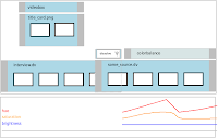
I've been working on the design a bit more. The top part of the diagram is an anatomical description of what objects in the advanced timeline should look like. Ideally I'd like all objects to support keyframeable properties, not just effects. This will require some changes to PiTiVi core -- in particular, all timeline objects will have to support getting/setting keyframes, which means internally they'll all have gst-controller objects. Personally, I think that's fine: one thing people overwhelmingly seem to want is to be able to directly control image opacity and audio volume.
One thing I'm not quite sure how to handle, though, are simple effects. You see, Edward's paper notes suggest that simple-effects (effects which only take one source as input) should appear in a small gutter above the other timeline objects within a given layer. This gutter would also be used for transitions. But this design leaves no room for over-laying keyframes, unless we allow simple-effects to expand to full height. But if we do that it will be difficult to distinguish beween simple effects and complex effects. So, perhaps *all* effects should simply be full-size objects , as in the above design. One thing I don't like about this, though, is that it's actually kinda hard to tell what's going on. Will videobox apply to just the image source directly below it, or the entire composition?
So, I came up with a different design. Move the properties down below the timeline, but keep them in sync with the timeline's scroll position. Now all objects can have as many properties as they want, and they can be kept completely separate from each other (or they could show as overlapping curves, I'm not yet sure which is best. The idea is that you select an object (in this image, the lighter colored simple effect is selected), and the property viewer displays its property graph. If you select multiple objects, one of two things could happen: it could show the intersection of the properties of all selected objects and let you set the same keyframe/values for all selected objects; or the property browser could display the properties of all selected objects individually. Ideally you'd want some combination of both, but I can't think of an elegant way to do that just yet.
Details: In either design, whenever you adjust a property, the viewer should show a preview of the keyframe after the effect has been applied.
Monday, August 11, 2008
Still thinking about the current problem of multiple selection draging. The only thing I've been able to work out so far is that there needs to be some separation between the event handling code and the widgets presented to the user. In other words, rather than doing Model/View-controller, there really should be separate Model/View/Controller objects. Goocanvas items are View-Controller objects: they represent data in the view, but they also handle user interaction. This is convenient when there's a one-to-one relationship. I wrote most of my code with this assumption in mind, so it's really easy to make any canvas item independently movable. Trying to move several items together poses a problem because each item will have an explicit pointer grab and receive all the pointer events. This is best summarized with the following diagram:
The alternative is to have some other object handle all the pointer events, and set the appropriate properties on the core objects:
I like this idea because it allows the selection to simply be the set of core objects on which the next command will take effect. It allows goocanvas and GTK to do all the event handling, however, it puts all of the logic for user interaction in one place: the signal handler attached to the root canvas item. Why is that bad? because not all PiTiVi core objects are alike, and not all have the quite the same interface. In particular, some objects have media-start/media-duration, while others don't. And if the media/start-media duration are not kept in sync with timeline start/duration, wierd things will happen. It would be great if they did, and this might be motivation to develop a consistent interface for all the PiTiVi core objects (i.e. abstract media-duration into media-offset).
Another way to get around this is to subclass the base UI timeline object and provide a handler which does the actual property setting. I don't really like this because it means that the current selection is a list of UI objects. This means the UI has to filter out the canvas items which are not directly selectable (because many items are actually groups of items).
Still another way of doing this might be to move the notion of selection out of the UI and into the back end.
In any case, the trimming handles on each source are a special case: we don't want to resize all the objects in the selection at the same time (do we?) My intuition tells me that users wouldn't care for that very much, because I wouldn't care for that very much. This isn't the end of the world: one simple solution would be to implement trimming handles as separate objects (as is currently done), and let them handle their own events. This way they won't propagate up to the root item, and therefore won't affect the current selection. And we can do this for any kind of UI element we don't want to become individually selectable, like, for example, objects representing keyframes on an effect item.
Wednesday, August 6, 2008
Redesign
Things were plodding along fairly well until I tried to start working on multiple-selection-dragging . I got stuck, seriously stuck. I couldn't find a clean way to handle this. Things got even worse when I started thinking about how I would implement keyframes and editing markers. I decided to go back to the drawing board:
Basically, after taking a few days a few days to deal with personal matters, I started redesigning the implementation of the advanced UI from scratch. I haven't written a single line of code.
The inspiration that I hit upon recently is the idea of a Control Point, which is a generalized mapping between something the user can see and manipulate to an arbitrary property belonging to some object in the model. The idea is that for every property in PiTiVi core that you want to control, you have a control point to control it. In addition, when properties in the advanced UI change, the control points update their values as well. This way, objects in the UI are actually defined either as control points or as sets of control points. All the user interaction will be routed through a central Selection object, and then dispatched to all the selected control points. This supports everything from multi-selection dragging to handling undo/redo.
Where this idea goes wrong is when you have an object defined as a relationship between control points that is not one-to-one. For example, the relationship between the start/duration properties of a TimelineObject and the Start/End points of a ComplexTimelineObject is not one-to-one. If you adjust the start or end point of the object independently, both the start and the duration values change. If you adjust the Start/End points together, only the Start property changes. This is a consequence of the mathematical relationship between the out-point of the object and the source's start/duration. I'm not quite sure where to go from here, but I think the best course of action is to provide a layer of indirection between the control points and properties. If you have a proxy object which has an in-point and an out-point, which in turn computes start/duration, for example, all the UI Selection object needs to care about are the In/Out control points.
Monday, July 28, 2008
I spent today hanging out with a friend of mine in San Francisco who does 3D modeling, rendering, and video editing for a living. While not a developer, he's a computer savvy user who can deal with complex user interfaces. After watching him use Adobe Premiere and After Effects for half an our, I did a short demo of PiTiVi. I wish I could say the demo went well, but, in fact, it crashed several times. Talking with him was useful because he has used three major commercial editors: Premiere, Vegas, and Final Cut. He's also familiar with Maya, and After Effects. The interview was casual, so I didn't record or take notes on the interview. A brief summary of what I learned is available here.
Revised Todolist
Revised Todolist
- Frame Snapping
- Collapse Selection
- Editing Markers (see below)
- Source Splices
Fix Text item clipping- Drag multiple selected objects
- Select Before Current Source
- Select After Current Source
- Undo/Redo
- Multi-layer editing
- Still Images
Thursday, July 24, 2008
Tuesday, July 22, 2008
Still images are not completely done in the back end, so they are still at the bottom of the stack. I'll bump them up to top priority once they are done in the back end. I am anticipating minor changes in the UI code to make still images work, but we'll see.
I managed to get the razor tool working today, which is incredibly satisfying. Next on the list is to fix zoom support, which was broken by the layout changes. Once that's done, I think it would be nice if the ruler's playback cursor not only extended all the way down the timeline, but was magnetic as well. This would mean that editing operations could easily be made to "snap" directly to wherever the playback head happens to be, including trimming and razoring sources.
Here's my revised todo list:
Split clips in advanced UI(Done)- Make zooming work again (In Progress)
- Magnetic Timeline Playback Cursor
- Frame Snapping
- Collapse Selection
- Editing Markers (see below)
- Source Splices
- make Text item something we can shrink so it doesn't protrude past edge of clip at high zoom (in progress)
- Drag multiple selected objects
- Select Before Current Source
- Select After Current Source
- Undo/Redo
- Multi-layer editing
- Still Images
- visual "bookmark" of some important point in the timeline
- magnetic edit point for spliting, trimming, and moving sources.
- general input to editing commands: For example, if you select n edit points and n sources, and then choose the razor tool, a cut will be made at the edit point for each source.
- Place edit points by clicking the marker button, or pressing m. The edit point will appear as a small triangle beneath the ruler at the current playhead position.
- You can fine tune edit points simply by draging them
- You can select edit points as you select any other timeline object
- When you activate the razor tool, drag a source, or trim a source, the effective cursor position will snap to the edit marker if the cursor position is within the edit marker deadband.
- If any edit points are selected when the razor tool is active, the razor tool will treat the edit points as input coordinates. Other commands may operate like this as well.
Sunday, July 20, 2008
Here's my revised todo list:
Fix graphic bug created when advanced timeline loads from file which places clips in the wrong order.(Done)Layout changes, implement a toolbar(done)Delete clips in advanced UI(done)- Make zooming work again (=P)
- Split clips in advanced UI (In Progress)
- make Text item something we can shrink so it doesn't protrude past edge of clip at high zoom (in progress)
make edge snapping work(done)- Drag multiple selected objects
- Undo/Redo
- Multi-layer editing
- Still Images
Thursday, July 17, 2008
The Vision
After a vigorous discussion on IRC this morning, my goals for the advanced timeline have crystalized in my mind. I'm shifting from my original focus on the simple timeline, and I am going to concentrate on basic editing in the advanced timeline. I thought I'd share my plans, since currently there are no mock-ups for the Advanced Timeline in any form. I wanted to take the time to include some sketches, but I'm getting tired and I want to get my thoughts out.
Design Principles
Design Principles
- Use direct manipulation for most common operations.
- Use noun-verb pattern for most other operations: select first, then click a button in the toolbar to perform a command.
- Minimize the number of modes. Modes are evil. Use context to decide which action is appropriate.
- Constrain actions to sensible values by default. Provide modifiers to override these defaults easily.
- Provide feedback. Change cursor styles, provide real time updates.
- navigating the timeline
- moving sources
- trimming sources
- adjusting edit points
- deleting sources
- moving large numbers of sources
- grouping multiple sources into single source
- decoupling audio from it's associated video
- Ruler at the top
- Sources in the middle
- Tools at the bottom
- Tools include: split, select-right, select-left, delete, unlink, group, ungroup,collapse selection,zoom adjustments,
- shift, ctrl, alt, and ctrl+alt act as quasi-mode modifiers
- Only conventional "tool" is the split tool. By default, you activate it first, then click where you want to cut. Later, I want to implement an alternate way of making cuts with markers, but people are already familiar with the current method, and in this case it makes sense to have a mode because it mimics the act of physically cutting a piece of film. After one cut, the tool resets.
- Delete, Unlink, Group, Ungroup, Collapse, all operate on current selection. These commands are only sensitive when valid on the current selection.
- By default, click or click-drag to select.
- Use shift to take the intersection of the current selection and the new selection.
- Click-and-drag on the current selection will drag every object in the selection.
- Two tool bar buttons will allow the user to extend the selection down the timeline to the right, or to the left, of the currently selected source.
- Group/Ungroup combine multiple sources into a single source. If the selection includes audio and video, two groups are made (one for audio/video).
- Unlink allows for dissociating linked audio and video tracks.
- Collapse arranges all sources in the current selection so that there are no gaps between them. (perhaps a leftward /rightward variant should be provided)
- When moving sources, sources snap to the nearest frame at the clip's native frame rate (depending on zoom), or the project's current framerate if the clip does not have frames. This can be overridden by holding a modifier key. Ctrl will disable frame snapping entirely, while alt will switch to the project's native frame rate.
- User can trim a source at any time by clicking-and-draging the trimming handles at the ends of the source widget. A source cannot be stretched beyond its actual duration (time stretching will be implemented later, as one of those evil modes). By default, trimming snaps to the clip's native frame boundaries, but this can be be over-ridden with shift/alt/control as described above with moving sources.
- The edit points of sources are "magnetic" within a certain distance. This means it should be really easy to make one source cut directly to another, despite the default frame-snapping. Care must be taken that the snap-to-frame feature doesn't interfere with this feature: it should take priority.
- When the edit point of one source coincides with another, the clips are automatically "spliced", meaning their in/out points become linked together.
- When two clips are spliced, the area between the two sources works as an edit-point adjuster. Essentially it adjusts the out point of the left source and the in point of the right source at the same time. A bi-directional arrow cursor <-|-> should be used to indicate the presence of the splice.
- By default, edits can snap to the frame boundaries of either clip. The user can override this with alt/control as described above.
- The splice can be broken by moving the clips or trimming them as usual: only the area in the center provides this feature.
- The UI should constrain the edit point in such a way that neither source can be stretched beyond it's native duration.
- Note this does not address the (possibly more common) scenario in which the user wants to adjust the in / out point of only one of the sources, but still keep the hard cut between them. In this case, the user first performs the trimming operation, then uses the collapse command to eliminate the bank space created.
- The user can add additional layers to the timeline. For the moment, these will merely be an organizational convenience, but later they will play a role in inputing effect operations.
- By default, audio will be mixed, and the topmost video source will play.
Future releases will introduce compositing support.
- Scrubbing directly on the timeline ruler will seek to that place in the timeline at the nearest frame in the current project settings.
- The user can use forward and back arrows to seek forward/back single frames at the current project framerate.
- Holding down keys causes repeated seeking. Holding shift increases the seek interval to 5 frames. Holding down ctrl increases the interval to 1/2 second. holding down alt increases the interval to 5 seconds. Holding down ctrl+alt moves the play head to the next edit point.
- If the playhead moves beyond the current scroll position, the timeline scrolls to the keep the playhead position in the center when the user releases a key.
- Zooms should always center on the current play head position, not the scroll position. the zoom control should provide meaningful zoom levels: 1, 5, 10 frames, 1, 5, 10, seconds, 1, 5, 10 minutes.
Wednesday, July 16, 2008
Post-Guadec Update
Ugh. I hate airlines, Delta in particular. Coming home was a real nightmare. I came back to find that my homebrew exploded all over my room, so tomorrow I get to shampoo the carpets. I was only able to salvage about half a pitcher of it, as it had a tendency to leap out of the bottles once the cap was removed. Fortunately, it turned out to be very strong.
I committed changes which implement resizing of clips in the advanced timeline this morning. So there's a pitivi first. I'm tinkering with support for "edge" snapping, which is crucial for usability. Edward is still working on refactoring pitivi core so that we can handle still images. I also added some cosmetic changes, because I was tired of the way things were looking. Unfortunately, the only thing giving you any clue you're resizing something, is the cursor, and that didn't come through in the screenshot.
Here's my revised todo list:
In the mean time, i'm thinking about how undo/redo support should work. It's kindof a tricky problem. One hackish way to implement it would be to serialize the timeline to the intermediate format after every major undoable event (via a signal emitted from PiTiVi core or in the UI). If the user wants to undo, then we can simply reload the undo tree, as if we were loading a file. That might be a way to implement single-action undo/redo for the next release. Multiple undo/redo will have to be a little smarter: a stack of operations needs to be mantained somehow, and each operation needs to have an inverse. Undoing in this case means poping the top of the stack, and applying the inverse operation to the timeline. The trick of course, is providing the infrastructure for both maintaining this history, and reversing the changes. Part of the problem is deciding which events are actually undoable. For example, during the course of a drag in the PiTiVi timeline, a source's position will be updated potentially thousands of times. We only care about its position before and after the drag operation, and only the UI can provide this perspective.
I wish I had some kind of handbook on how to implement these big, complicated, yet crucial features.
I committed changes which implement resizing of clips in the advanced timeline this morning. So there's a pitivi first. I'm tinkering with support for "edge" snapping, which is crucial for usability. Edward is still working on refactoring pitivi core so that we can handle still images. I also added some cosmetic changes, because I was tired of the way things were looking. Unfortunately, the only thing giving you any clue you're resizing something, is the cursor, and that didn't come through in the screenshot.
Here's my revised todo list:
- Fix graphic bug created when advanced timeline loads from file which places clips in the wrong order.
- Layout changes, implement a toolbar
- Delete clips in advanced UI
- Split clips in advanced UI
- make Text item something we can shrink so it doesn't protrude past edge of clip at high zoom
- make edge snapping work
- Drag multiple selected objects
- Undo/Redo
- Multi-layer editing
- Still Images
In the mean time, i'm thinking about how undo/redo support should work. It's kindof a tricky problem. One hackish way to implement it would be to serialize the timeline to the intermediate format after every major undoable event (via a signal emitted from PiTiVi core or in the UI). If the user wants to undo, then we can simply reload the undo tree, as if we were loading a file. That might be a way to implement single-action undo/redo for the next release. Multiple undo/redo will have to be a little smarter: a stack of operations needs to be mantained somehow, and each operation needs to have an inverse. Undoing in this case means poping the top of the stack, and applying the inverse operation to the timeline. The trick of course, is providing the infrastructure for both maintaining this history, and reversing the changes. Part of the problem is deciding which events are actually undoable. For example, during the course of a drag in the PiTiVi timeline, a source's position will be updated potentially thousands of times. We only care about its position before and after the drag operation, and only the UI can provide this perspective.
I wish I had some kind of handbook on how to implement these big, complicated, yet crucial features.
Friday, July 11, 2008
Guadec Update
Edward and I worked out the following todolist for me:
Meanwhile, Edward is working on adding still picture support in PiTiVi core.
- (done) Fix file load/save support
- (done) Multiselection in advanced UI
- Layout changes
- Resize clips in advanced UI
- Deleting in advanced UI
- Split clips in advanced UI
- Multi-selection Dragging
- Time-stretching of clips
Meanwhile, Edward is working on adding still picture support in PiTiVi core.
- The first step is a bit of refactoring to move useful code into more abstract classes.
- A custom freeze-frame element will be created for actually handling still pictures within a timeline.
- This will be used to implement a TimelineImageSource object in PiTiVi core.
- Finally, changes to the discoverer will be necessary to avoid long delays when importing large images.
Tuesday, July 8, 2008
Even at GUADEC, Slow Going
GUADEC is a lot of fun, but the network at the venue is a bit dodgy. Worse still, a number of useful ports are blocked. This has complicated just about everything. Also, I tried to update my gstreamer install and the cvs-update.sh script barfed all over everything, borking my cvs install of gstreamer. I might have it fixed by tomorrow morning =(
The good news is that Edward and I fixed a couple of rendering bugs in the advanced timeline. The key to the problem was the GTK+ debugging flag --gtk-debug=updates, which shows you which areas are being redrawn (though I can't yet use this on my machine, still need to recompile the gtk+ library to enable debugging).
Also, I finally got to look at Edward's design notes for the Complex UI. I finally have an idea of what I'm building. There's still a lot to discuss, but Edward and I haven't quite found time for a hacking session.
That's about it for now.
Monday, July 7, 2008
Bugs
Apparently there are some bugs in the latest goocanvas code which cause the timeline to update portions of the display which are much too large. I'll be looking into this at some point this week. Also, a fellow contributor has submitted a patch to add a vertical playhead bar to the timeline.
Friday, July 4, 2008
Update
I lost a couple days due to a stomach bug of some kind (too much street food in Istanbul?) I've been using some of this down time to do research. GUADEC is next week, and I expect that Edward and I will get some serious hacking done during that time.
I've been meaning to interview some of my video professional friends to see how they use existing video editors, and find out what they like and don't like about them. In preparation for that, I have been reading on-line tutorials for existing video editors to get an idea of what expert usage looks like. I like the user submitted tutorials better than official documentation, because it helps me get into the frame of mind of a user, rather than a designer. Tutorial explanations hilight the how users conceive of the problems they are trying to solve much differently than designers. Often they use tools originally intended for a different purpose to achieve their ends. The downside, of course, is that tutorials are mainly written by expert, tech-saavy users. Right now, the main thrust of PiTiVi's development has been targeted at novice users, or at least users unfamiliar with the domain of video editing.
Part of me wonders whether or not this is a mistake: since PiTiVi is a linux video editor, relatively few novice users have access to the application. And we already have Kino, which is more mature than PiTiVi. If I were a novice user trying to get video editing done with Linux, Kino would be my only real choice. On the other end, we have Cinelerra, which seems to offer more high end features (though I've never gotten it to work). Maybe PiTiVi should aim for the middle-of-the road, intermediate crowd. Instead of dumbing down for 5 year olds, or making some ridiculous attempt to out-maneuver FCP (not going to happen), we shoot for an even balance of features: more precision and control than Kino, but don't plaster the screen with controls and widgets. At the same time, we should provide an environment that will be familiar to anyone who has used Premiere, or FCP, or even iMovie, so that their skills transfer. This will fit well with features that gstreamer already provides: an open format timeline, and real time processing of transitions and filters.
PiTiVi could fill a real niche in the amature filmmaking crowd: we can support the odd-ball movie formats that modern digital "still" cameras, like Canon PowerShots, spit out. If PiTiVi makes using these cameras as simple to use as other editors make DV, it will be an attractive tool for people making movies on a shoestring budget.
The existing simple timeline code might be re-imagined as something similar to FCP's media browser: useful for setting rough edit points on clips not yet imported to the timeline, and we needn't worry about providing support for effects or transitions.
Relevant Tasks:
ToDo List:
I've been meaning to interview some of my video professional friends to see how they use existing video editors, and find out what they like and don't like about them. In preparation for that, I have been reading on-line tutorials for existing video editors to get an idea of what expert usage looks like. I like the user submitted tutorials better than official documentation, because it helps me get into the frame of mind of a user, rather than a designer. Tutorial explanations hilight the how users conceive of the problems they are trying to solve much differently than designers. Often they use tools originally intended for a different purpose to achieve their ends. The downside, of course, is that tutorials are mainly written by expert, tech-saavy users. Right now, the main thrust of PiTiVi's development has been targeted at novice users, or at least users unfamiliar with the domain of video editing.
Part of me wonders whether or not this is a mistake: since PiTiVi is a linux video editor, relatively few novice users have access to the application. And we already have Kino, which is more mature than PiTiVi. If I were a novice user trying to get video editing done with Linux, Kino would be my only real choice. On the other end, we have Cinelerra, which seems to offer more high end features (though I've never gotten it to work). Maybe PiTiVi should aim for the middle-of-the road, intermediate crowd. Instead of dumbing down for 5 year olds, or making some ridiculous attempt to out-maneuver FCP (not going to happen), we shoot for an even balance of features: more precision and control than Kino, but don't plaster the screen with controls and widgets. At the same time, we should provide an environment that will be familiar to anyone who has used Premiere, or FCP, or even iMovie, so that their skills transfer. This will fit well with features that gstreamer already provides: an open format timeline, and real time processing of transitions and filters.
PiTiVi could fill a real niche in the amature filmmaking crowd: we can support the odd-ball movie formats that modern digital "still" cameras, like Canon PowerShots, spit out. If PiTiVi makes using these cameras as simple to use as other editors make DV, it will be an attractive tool for people making movies on a shoestring budget.
The existing simple timeline code might be re-imagined as something similar to FCP's media browser: useful for setting rough edit points on clips not yet imported to the timeline, and we needn't worry about providing support for effects or transitions.
Relevant Tasks:
- clip logging and renaming in the library
- import movies from "still" cameras
- "off-line" (low-res) editing and recapturing (high-res)
- synchronizing audio and video from different sources
- animation and timelapse from sequences of stills
ToDo List:
- fix the freeze plugin, or write a replacement, so it works with gnonlin
- implement transition and effect objects in PiTiVi core
- implement still image sources in PiTiVi core
- discuss the complex UI design (please bring your notes, Edward)
- (optional) make other mixing modes in videomixer available through property
- (optional) tinker with gst-editor a bit, see if it can be made more stable
Monday, June 30, 2008
Starting to Look Good
The goocanvas version of the advance timeline is taking shape. The above screen shot shows a timelinew with a single source zoomed in. I haven't tried messing with multiple sources, but it shoul work alright. This revision is a bit of a regression, as the timeline now lacks the ability to trim sources, but you can move them. The timeline is also miss-aligned. My gut tells me that it's in the wrong spot to begin with, and the best thing to do would be to drop it down below the toolbar. This would leave more room for other tools, like a trimming tool.
Now is where I need your help: color schemes, layout suggestions, usability concerns. The current source widgets are just rectangles, do people want thumbnails or just text to cover those? How should effects be represente visually? I don't really want to go too much farther without a good idea of what people want to see.
Sunday, June 22, 2008
Got something done! Yea!
Testing screenshot showing a ComplexTrack with several sources, two of which are overlapping. Sorry about the colors: I'm a programmer, not an artist.
I'm currently in Prague, which is a gorgeous town. Primarily due to lack of planning, I've got a couple of dead days which I used to work on PiTiVi. I had left the States with out a complete gstreamer install, without svn installed, without goocanvas, and a whole host of other silly things that are easy to take care of when you have reliable internet access, but impossible without it. Today, after two weeks, I have finally made another commit.Basically, I figured out the easy way of making some of making some of my utility functions a bit more friendly to MVC. I have a function calle make_dragable which works on any goocanvas.Item object. It connects signals and sets appropriate data items to make the canvas item dragable. Previously, this function and its associated callbacks handled all the interaction from button_press to button_release, including actually moving the object in question. This posed a problem for the MVC design pattern, as the object should not actually be moved until the appropriate callback is received. I wanted to save as much of this code as possible, as it handles a lot of nice details, like keeping track of the mouse-down offset (so that the object being moved doesn't suddenly jump to the cursor position). I had tried various ways around the problem, such as having a flag to not set object position, using part of the code and connecting signal callbacks manually, even starting over from scratch. Everything I tried had problems from breaking existing code to just being downright buggy. There's no substitute for already working code.
I finally hit on the solution in the shower yesterday morning, and it involved changing about 3 lines of code to add an extra callback. Worked like a charm. I can finally get moving again. This will also make the simple timeline code easier to manage, so though I haven't written many lines of code in the last 2 weeks, I have actually made a good deal of progress in terms of thinking about the problem.
Wednesday, June 18, 2008
Update
Well, i've been a bit preoccupied with travel preparations and the traveling itself. I'm also finding development on the eeepc a challenge, partially internet access was hard to comeby. I'm slowly chipping away at the problem, working bout 45 minutes a day. I haven't got anything commit-worthy yet, i'm still trying to sort out some issues. Also, a lot of the gstreamer encoding plugins failed to build, and the sample video i brought is a little too intense for the eeepc. I can't re-encode it, though, without the encoding plugins. Anyways, I'll post another upddate later this evening. I have a long train ride ahead of me tomrrow, so I ought to get a lot of work done.
Sunday, June 8, 2008
Started Porting Advanced Timeline
While it is true that the advanced timeline presents a simpler visualization than the simple timeline, the simple timeline is still simpler: it only represents the video composition of a timeline, and relies on the fact that video and audio sources are linked to each other to make it appear as though sources are complete movie files. The complex timeline presents a simpler visualization, but it might manage dozens of instances of each. So, my initial optimism has begun to fade somewhat. I'm going to just focus on re-implementing existing functionality, while also adding support for resizing clips which currently can't done. Transitions and effects will be easier to implement in the simple timeline first.
Did some light refactoring yesterday, eliminated a redundant class, and restructured the simple timeline code somewhat so that it will be easier to add elements to it that aren't scrolled along with the timeline. The structure of the simple timeline now follows the structure of the complex timeline more closely. I've been studying the advanced timeline code to better understand what has to change, but I'm still confused about a few things.
I've started working on a ComplexTrack() class, based on SmartGroup which emulates the existing timeline widget pretty closely. I could easily spawn separate instances of the class to connect to the video and audio compositions. The real issue is that pitivi emits separate signals for effects and transitions. I'm wondering if another layer of indirection might be needed, but of course, a lot of this depends on just what the complex timeline is supposed to look like. Will effects overlap sources? will transitions appear on on a separate track? My primary goal is just to replace the existing layout code with goocanvas, then go one step further and add trimming support (as opposed to mere cutting support, which splits clips in half). What will be the semantics of multiple tracks in PiTiVi? Priority? Nothing at all?
One thing I've realized over the last few days is that the scale_x property is not going to work for handling zooming. It's a great way to handle resizing the simple timeline, but if I use it to provide zooming in the complex timeline, there will be side effects. All the images, fonts, outlines -- everything in the canvas -- will be stretched or compressed by scale_x, which will result in unreadable text and distorted images at higher levels of zoom. Instead, I'll retain the existing zoomable widget interface (possibly in a slightly modified form) and use it to adjust scale "manually". One change I would like to make, however, is in the zooming widget itself. I'd like to provide meaninful levels of zoom, instead of the "bigger-or-smaller" caveman controls we have now. The sequence would go something like ... 1-frame, 5-frames, 10-frames, 50 frames, which are meaningful for movie projects, as well as .1s .25s .5s, 1s, 10s, 1m, 10m...The frame adjustments would be based on the current project framerate, and would essentially make each quantity of frames a standard width. For video projects, it would also be nice to constrain the playback head (red line) by 1/FPS milisecond for precise edits.
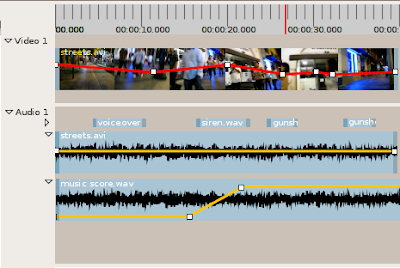
There are two custom canvas items that would be good to have in the complex timeline, but for now I'll just use the existing widgets: the first is the top level ruler, and the second the thumbnail viewer. For the complex timeline, though, I want more than that: I want a "filmstrip" widget, one which presents a sequence of thumbnails, the number of which is proportional to the visible width of the the widget.
Oh one more thing...I've been sloppy about the distinction between widgets and canvas items. There is a big difference, so I'm going to be more careful about this in the future. In general, though, they are equivilent because you can embed gtk.Widget objects in a canvas, and goocanvas.Canvas() objects are gtk.Widget objects. You can wrap one in the other, essentially.
Thursday, June 5, 2008
Simple timeline is ported over to goocanvas, at least to the point where it's usable. There are some graphic glitches that I'll fix later, and I want to improve the code which handles external drag-and-drop (currently sources are always appended, I'd like to have some interaction which allows you to drop sources anywhere). I'm switching my attention to the advanced timeline.
I'm probably going to gut all the existing timeline code completely, because most of what's there is redundant with the facilities goocanvas provides. For example, zooming is easily handled by goocanvas's scale_x property. In addition, scrolling is taken care of automatically if you use a gtk.ScrolledWindow, so the layers of indirection are really, really unecessary. I can handle the informational messages directly in goocanvas...basically the structure of the timeline will look like this (more-or-less, parent classes in parens, trailing * indicates more-than-one).
* Generic timeline widget (gtk.ScrolledWindow)
**SimpleTimeline (goocanvas.Canvas)
*** SimpleSourceWidget*
**ComplexTimeline (goocanvas.Canvas)
*** PiTiViTrack*(smartgroup)
**** PiTiViSourceWidget* (goocanvas.Rect)
Monday, June 2, 2008
Conversion of SimpleTimeline to Goocanvas almost complete
I solved my conceptual dillema by introducing Yet Another Layer of Abstraction: I subclassed HList() to create TimelineList(), which harbors all the application-specific code. This required reworking the HList() class a bit, but it still works as it did before. I even manged to get rid of some code I didn't like in the process. So, now the mouse events trigger changes to the underlying composition, and the UI is only updated in the callback. All that remains now is to handle the external drag-and-drop events (of FileFactories onto the timeline) a little better, so that the user can see where their source will end up before making the drop.
I asked about my pointer-event propagation problem on the goocanvas developer mailing list. It turns out that the only way to get signals from goocanvas.Widget items that contain a widget with an xwindow is to connect to the widget itself, rather than the goocanvas.Widget item. This will require conversion of the coordinates. That might not be so hard, so it's worth pursuing. The current "ghostly" SimpleSourceWidgets are rather distracting, but it's low priority for now
After that, I'm going to start porting the advanced timeline over to goocanvas. This should be relatively straightforward. Each source in the timeline will have a goocanvas.Rect() object, or perhaps a derivative, which will represent it in the timeline. There will be a direct mapping from time to position along the x axis. Zooming will be handled by adjusting the scale_x property of the canvas, and scrolling will be handled automatically by a gtk.ScrolledWindow (that will also contain the SimpleTimeline, and handle scrolling for that as well). Once that's done, PiTiVi will basically work as it did before, except that now it will be easier to add new features using goocanvas. By this time I hope to have development versions of gstreamer built, because I'll be on my way to europe.
Sunday, June 1, 2008
Setbacks
Today worked on the SimpleTimeline using Goocanvas. It wasn't easy: a number of unexpected obstacles presented themselves. The first was the challenge of merging the existing SimpleTimeline code into the new code, and getting drag-and-drop to work as it did before. Once I had done that, I was able to add and delete the existing source widgets from the timeline.
Erhm, well kindof. Actually this is a transient glitch, it goes away as soon as you resize the timeline.
See, now that's better. Except once I got to this point I found that the re-orderable list that I'd spent so much time on didn't work. Event signals never make it to the canvas. They seem to be trapped by the widget. I modified my test code to use widgets instead of native canvas items. A little experimentation showed that only widgets which don't have their own xwindow (as do gtk.EventBox and gtk.DrawingArea) will emit events within goocanvas. So, if I just change the parent of the SimpleSourceWidget to something like HBox, it should work...right?
Well, sortof...now they look like "GhostSourceWidgets"...wooooooooooo! Hmm, I know. I'll make a ghetto hack! If I just plop a goocanvas.Rect behind the widget, and group the two together, then I'll have an opaque background that will prevent widgets from blending together...
Ermmm...no.
Saturday, May 31, 2008
Progress
I thought I'd post some snapshots of the new timeline code. I wanted to test the dragging code independently of PiTiVi, so it is being run from an external script.
Timeline displaying some test items at their default size.
The Timeline can be enlarged, in which case the items inside are automatically enlarged. This takes advantage of goocanvas's scaling.
The timeline is now fully reorderable, though the interaction is far from perfect. It's not as smooth as it was in my early prototype, but my early prototype didn't handle items of varying widths. I'm anxious to move on, but I really want to make sure that this code works properly on its own before I throw in the added complexity of MVC.
One issue which I haven't yet decided how to handle is transitions. Should I allow multiple transitions to be moved next to each other on the timeline? What would that mean? I don't think there's a use case for multiple transitions in between two clips. If I'm not to allow multiple transitions, then I have to think of a way to prevent them from stacking against each other, which could get hairy.
Currently I have a SimpleTimeline which derives from Canvas(). This in turn uses a more general HList(), which I had hoped to make as general as possible. However, I think my goal of having a generic, re-orderable list class is not going to work. There is too much application-specific behavior in the timeline. Tomorrow, I'm going copy the list code directly into the SimpleTimeline class, which already implements the re-orderable portion of the list anyways.
Friday, May 30, 2008
Implementing Reorderable List
pitivi.timeline.composition.Composition provides the following relevant methods:
When the user clicks on an item in the timeline, the source will be moved to the top layer of the canvas (so that it shows above other objects as it is moved. The user can then drag it freely in the x direction within the bounds of the canvas, but it will be completely constrained in the y direction.
If the object is moved beyond a certain threshold to the right or left, the position of the nearest object to the one being moved will be swapped (i.e. the order of the objects will change, but the object being dragged will still be under the control of the mouse). The operation finishes when the user releases the mouse.
Two ways to do this:
My goal for my first commit is to come up with a drop-in replacement for the existing timeline. But, in the interest of being forward thinking, there's a design constraint here I almost forgot to consider: Transition widgets. Handling child widgets of different sizes and aspect ratios will not be so hard, but transitions are only supposed to go between two sources. How can I easily enforce this constraint? Maybe by fiddling with the threshold values, but remember that transitions are optional. I could use a mandatory space between sources, but to be honest I really hate that idea. I'll sleep on it for now. One thing at a time.
getSimpleSourcePosition
addSource
appendSource
moveSource
removeSource
insertSourceAfter
condensed-list-changed
source-added
source-removed
- calls insertSourceAfter() when an user drops item to timeline
- calls removeSource() when user deletes item from timeline
- calls moveSource() when user moves a source to a new position
- responds to the "source_added" signal by creating a new source widget and adding it to the timeline
- responds to the "source_removed" signal by removing its widget from the timeline
- responds to the "condensed_list_changed" signal by updating items to their new position
When the user clicks on an item in the timeline, the source will be moved to the top layer of the canvas (so that it shows above other objects as it is moved. The user can then drag it freely in the x direction within the bounds of the canvas, but it will be completely constrained in the y direction.
If the object is moved beyond a certain threshold to the right or left, the position of the nearest object to the one being moved will be swapped (i.e. the order of the objects will change, but the object being dragged will still be under the control of the mouse). The operation finishes when the user releases the mouse.
Two ways to do this:
- When the threshold value is reached, simply call moveSource() to exchange the positions of both sources. The advantage of this approach is that the UI updates automatically when the composition emits the "condensed-list-changed" signal. One possibly negative side-effect is that the object the user is dragging will suddenly "jump" in to position. Another potential side-effect is that the "condensed-list-changed" signal might be delayed for some reason, leaving the timeline in a sorry state even after the user releases the mouse.
- When the threshold value is reached, only swap the sources visually. Save the proposed changes until after the user releases the mouse. Then call moveSource() to move the source. This avoids the "jumping" side effect, but introduces a different problem. The visual timeline and back end will be temporarily inconsistent. If the "consensed-list-changed" signal is delayed, then the user's changes are incorrectly displayed. We can get around this by automatically restoring the list to its original state after the user releases the mouse. This could also be confusing: the user sees their clips move into a new position, then move back to their original position after releasing the mouse, then move back to the new position after the signal arrives.
My goal for my first commit is to come up with a drop-in replacement for the existing timeline. But, in the interest of being forward thinking, there's a design constraint here I almost forgot to consider: Transition widgets. Handling child widgets of different sizes and aspect ratios will not be so hard, but transitions are only supposed to go between two sources. How can I easily enforce this constraint? Maybe by fiddling with the threshold values, but remember that transitions are optional. I could use a mandatory space between sources, but to be honest I really hate that idea. I'll sleep on it for now. One thing at a time.
Thursday, May 29, 2008
Distro Shopping
I spent the day distro shopping, but since I have not really found what I wanted, I have decided to stop worrying about it for the moment. Ubuntu's support of GStreamer isn't that bad. I have other beefs. On the other hand, the my criticisms of Ubuntu also apply to just about every other distribution out there. It's just that Ubuntu initially set the bar very high, and I have been really disappointed with the last two or three releases. I wait and wait, but the functionality doesn't improve, and even regresses. It's very frustrating. I figure that if I'm going to have to tinker with the OS, that I might as well use something much less restrictive. Something that really gives me what I want.
That having been said, enough of this. I can do a fair amount of PiTiVi development without up-to-date gstreamer installed. I have a job to do, and it's time to start doing it. So, for the next three days, I'm going to start working on things which do not depend on having up-to-date gstreamer libraries.
Switch Simple Timeline To Goocanvas
I've already got a prototype of this working, but there are a couple things that need to happen first.
Once I get gstreamer-cvs installed, I can start working on some other things.
That having been said, enough of this. I can do a fair amount of PiTiVi development without up-to-date gstreamer installed. I have a job to do, and it's time to start doing it. So, for the next three days, I'm going to start working on things which do not depend on having up-to-date gstreamer libraries.
Switch Simple Timeline To Goocanvas
I've already got a prototype of this working, but there are a couple things that need to happen first.
- I have a prototype container class that derives from goocanvas.Group which handles repositioning, adding, and deleting groups of items that I use in gst-editor.py. I want to re-factor this class so that it derives directly from goocanvas.Canvas.
- I have a prototype timeline implemented as a python script. It simulates a re-orderable list of canvas widgets. This code needs to be rewritten slightly so that it is more friendly to MVC. In particular, it needs to wait for signals from the model before anything in the UI is reordered.
- Merge the code from (2) above into (1)
- Test code independently with standard canvas objects of varying sizes
- Merge the external drag-and-drop support in from the existing PiTiVi timeline widget
- Test the code independently of pitivi using existing PiTiVi source widgets
- Merge the new code into PiTiVi
Once I get gstreamer-cvs installed, I can start working on some other things.
- Transitions
- Titling Support
- Still Image Support
Gah! Paperwork
No sooner do I have all my European flights and hotels booked than I realize I hadn't registered for guadec. And now registration is closed...Meanwhile I'm behind on sending in the tax forms to Google. I've moved out of my old cooperative and into this new one that doesn't have a house laser printer. I dug out my old inkjet and spent an hour struggling with CUPS to get it to print only to find that the ink has gone dry. Meanwhile I'm trying to send in the DMV paperwork for my two motorcycles that I'm selling. Combine that with the joys of moving, unpacking, throw in a visit to an ailing mother in a different town, add a spontaneous, free ticket to a rock concert, and you get a Summer of Code student who hasn't been able to write any code for two days =(
Meanwhile, Ubuntu has put the nail in the coffin in the form of an "update" they released today which uninstalled devhelp and prevents my reinstalling it. Seriously, Ubuntu is going downhill. I am done with their silliness. The real question is where to go next. Maybe gentoo, maybe arch, maybe something else.
Wow! Comments!
Thanks, those of you who replied to the last posting. I agree, installing gentoo *on* the eeepc would be problematic. It just seems that, since eepc's are mostly the same hardware, that there ought to be an disk image of a functioning install that I could just dd onto my hard drive. Then all I have to worry about is setting up my development environment. Cross compilation isn't really a good idea because it seems like it would leave me without the ability to install software when away from my primary machine.
With regards to the SSD hardware, I have heard that it will take quite a few write cycles before one starts having problems. Unless you know about someone who killed their EeePC by trying to install gentoo, I'm not really worried about anything except running out of disk space. And I
Tuesday, May 27, 2008
I promise to stop hacking and get to work
For the last couple of days i've been hacking pretty heavily on my gst-editor, another gstreamer project closely related to pitivi. I've made some serious progress in terems of UI, but there are some wierd bugs that have basically led to an impasse. In any case, it's time for me to start work on PiTiVi in earnest. Working on gst-editor has taught me what I need to know about gstreamer and goocanvas.
There is one main barrier to working on PiTiVi, and that is finding a reliable and efficient way of setting up a gstreamer development environment. Now that Edward has written his QA system for gstreamer, a large number of bugs are being fixed. This has led to rapid changes in gstreamer, which is on a monthly release cycle anyways. It's much too fast to rely on a distribution like Ubuntu to keep pace. I have been tinkering witht he idea of installing Gentoo or Arch linux, especially on my eeePc, which I'll be taking with me to europe. Holding me back is the knowledge that configuration will take a long time. I have grown used to the "it just works" nature of Ubuntu. For the most part, I want other people to make choices for me. There are only specific areas in which I want to override those choices: gstreamer, power management, network management. I don't care who makes the choices, as long as it works. I am suspicious that ubuntu doesn't include a complete gstreamer distribution, but I don't know how to check. Do I contact the package maintainers? Even if I build my own packges, I'm still limited by the dependencies that ubuntu includes. If there's some plugin which uses a library that ubuntu doesn't support, then it doesn't matter if I go to the trouble to build it myself.
Chicken an egg. I really wish I had a local gentoo guru who could get me past the initial setup quickly, so that I could concentrate on my work and not the system configuration. When I was using debian, nothing ever worked right. I can only imagine that gentoo would be similar in terms of leaving me a lot of work to do in order toget a user experience similar to what Ubuntu offers. On the other hand, ubuntu is p*ssing me off as of late: their power management system as of 8.04 is terrible, it's bloated, thunar *never* seems to be able to unmount disks, and 8.04's kernels don't support eeepc hardware out-of-the box. I had to go out of my way to set the machine up in the first place. If have to tinker with ubuntu, maybe I might as well just install a more flexible distribution. Sigh....
Friday, May 23, 2008
eeePc
I got an eeePc for traveling this summer. The following image documents a watershed moment: PiTiVi running on an eeePc. As you can see, there are some screen size issues to work out. But it does work, and I was able to make some editing actions. The eeePc seems to have some trouble playing back the high-res video I took from my friend's cannon powershot. After about 15 seconds, playback becomes jerky. This is in both PiTiVi and Totem. I'll try the same video on my thinkpad to make sure the file isn't corrupt in some way. In any case, I'll have to re-encode the video at a lower resolution / higher compression to save space. Hopefull the playback issues will be taken care of at the same time.
Wednesday, May 21, 2008
Corrections
Turns out a couple of the things I said about goocanvas don't make sense now that I've reread them. Goocanvas provides all kinds of support for dynamically resizing and repositioning individual elements: it'd doesn't provide so much support for notifying other parts of the program about those changes. And it only provides rudimentary support for hierarchical nesting of canvas items.
I don't want spend time writing custom canvas items because it's not necessary for PiTiVi: rectangles and text objects will be fine, or I'll embed some existing GTK+ widgets into the canvas. That having been said, I would like to be able to easily compose primitive objects together to make more complex ones: rectangle + text = labled box! I also want to be able to make container classes similar to GTK+s container classes, which dynamically grow and shrink as objects are added or deleted. I'd also like to be able to have the container's size update if any of the child objects change in size. In order to do that, those container classes need to know whenever one of the child objects moves or changes size.
Basically, you have simple items and you have groups. All objects have transform matrices and bounds, but you get no notification if any of these change. You have to use the gproperty interface if you want notifications of changes. This means you can't use the translation matrix portion of the API, since they won't be in sync. Goocanvas groups have no size or position properties either, so I have chosen to add this to a derived class I call a "smartgroup". The issue is that in order to calculate the size of the smartgroup, I need to know the size and relative position of all the children. And now we come to the crux of the matter: since there is no consistent property interface for size and position, I have to make some derived primitives to support this as well. Honestly, this feels like a design oversight within goocanvas. It seems like the stock items should do this for you.
That having been said, goocanvas is great. It's efficient, and the rendered output looks awesome. It's easy to build up the kind of functionality I want, so most of the above should prove to be relatively minor setbacks.
Turns out I HAVE a blog!
As you can see, I didn't get much use out of this account during the previous year. Well, Here I am again. I've been asked to set up a blog for SoC 2008, and this will do. I'd like to start the summer off with a brief discussion of the challenges that lay ahead for my SoC coding.
Bleeding Edge Gstreamer
The video editor relies on up-to-date gstreamer and gnonlin, sometimes even SVN. Installing these from source is kindof a pain. I tried installing gentoo in a chroot, and using this to build recent gstreamer. This is a great option on my thinkpad, but not so great on my eeePc, which I will be using in europe this summer. So, step one is to get both of my development machines ready to go with bleeding edge gstreamer libraries.
Limitations with Goocanvas
I have been tinkering with goocanvas for a couple of months now. I think it is a very useful library, but there are a couple of issues with it in its current form.
Goocanvas doesn't give a lot of help with interaction. There is a "container" class called Table, but this going to help me implement a re-orderable list for the simple timeline. Aside from the fact that goocanvas is based on gobject, there isn't much support for dynamically resizing and repositioning objects. I need to build up dynamic containers first, and then make the individual container items reorderable.
There is no consistent property interface between the stock canvas items. The majority support x, y, width, and height. But a few do not, namely Text, Circle, Polyline, and Path. Fortunately, I will only be using the Text object, so I think I can safely assume that all the widgets involved support those properties.
Relationship with Advanced Timeline
The simple timeline is both a simplification and an abstraction of the core objects. The advanced timeline maintains a closer mapping between PiTiVi core and the user interface features. This means that many things which can be done in the advanced timeline will not be visible in the simple timeline. So what happens if the user makes a change in the advanced timeline, then switches back to the simple timeline, and makes a change there? Will some data be lost in the translation? Should the simple timeline attempt to keep track of changes to the advanced view and prevent them from being lost?
The two main issues I can see are:
1) in the advaned view, sources may overlap each other
2) in the advanced view, source and effect properties will vary over time
Both of these can't be represented in the simple view. So what happens if you spend an hour carefully tuning volume settings in the advanced view, then switch to the simple view and move the volume slider? Does it amplify the whole curve? Does it flatten the curve? Do we even allow the volume slider to move after changing settings in the advanced view?
Subscribe to:
Posts (Atom)
Blog Archive
-
▼
2008
(41)
-
►
July
(11)
- I spent today hanging out with a friend of mine in...
- Make zooming work againMagnetic Timeline Playback ...
- Still images are not completely done in the back e...
- See previous posting for current progress. Just wa...
- Here's my revised todo list:Fix graphic bug create...
- The Vision
- Post-Guadec Update
- Guadec Update
- Even at GUADEC, Slow Going
- Bugs
- Update
-
►
July
(11)